
Web accessibility - the 18 best editor tips
Optimising web accessibility
This guide gives you grab 'n go tips that you as a web editor can use in most Content Management Systems

In this article, we will focus on some very basic tips for editors who have realised the value of making a website accessible to everyone. The tips you'll receive in no way require you to have any coding knowledge. They are grab'n go tips that you as a web editor can use in most Content Management Systems.
Web accessibility - in a nutshell
Web accessibility - or Web Accessibility - basically means making your website accessible to all people, including users with different types of disabilities. It also means that you make your website accessible to the assistive technologies that users with disabilities use, such as screen readers, eye trackers, special keyboards, etc.
The article on the top 18 editor tips for an accessible website covers
- Clear hierarchy in headings
- Link text used for different destinations
- Link titles
- Link opens in new tab
- Link styling
- Contrast ratio between body text and background
- How to check the colour contrast
- File name as default for all text
- Decorative images
- Informative images
- Functional images
- Images with text
- Transcripts
- Captions
- Audio descriptions
- Content that moves
- Web Accessibility with Siteimprove
- Web Accessibility with Google Developer Tool
Headings
-
Clear hierarchy in headings
The headings on a website should be organised hierarchically. Think of headings as signposts for users.
Blind or visually impaired people use screen readers to read the content on a web page. A screen reader navigates primarily via the tag that a heading is encoded with.
To provide an overview for the user, the screen reader can read out a list of all the headings on a page if the headings are tagged correctly. Some users with impaired hands and arms use the TAB button to navigate through the page headings, so the order is crucial for understanding.
When working in your CMS text editor, you have the option to tag your text. You can probably choose whether the text is paragraph, H1, H2, H3, quote, etc. in a dropdown menu. The text formats differ from each other in their styling and will visually appear very different. This is why many people make the mistake of choosing the tag that best fits into the visual whole and ignore whether the order is hierarchical. This can cause major comprehension challenges for the blind or partially sighted user, because the text that the screen reader announces does not appear in a meaningful order.
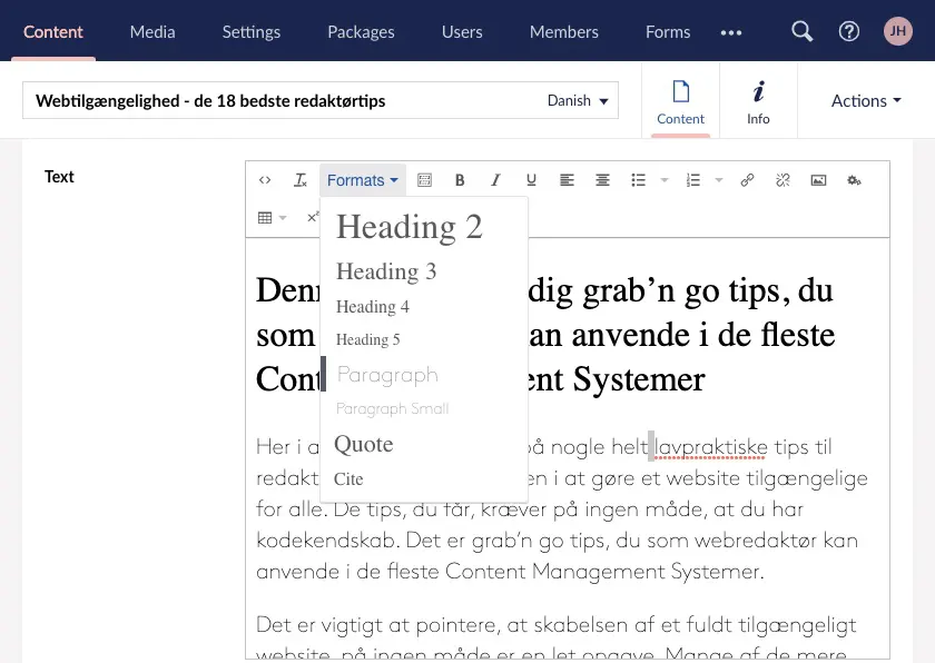
Heading tags used in the right order will give an accurate picture of what is on the web page. Therefore, headings should not skip levels. There should be at least one main heading (H1) on the page and subheadings to this should be H2 etc.
Incorrect use of Heading tags not only affects the user experience, it also makes it more difficult for search engines to crawl and understand your content.
Links
2. Link text is used for different destinations
The same link text is used for multiple links that lead to different destinations. Some users can't tell the difference between these two similar links if it's not explained.
Like most people, you probably have a web page that contains an overview of all your blog posts or news.
For aesthetics, all links end with the same generic link text "Read more" or "Click here". Without a link title that enriches the link with good information, it is difficult for users navigating via screen readers to understand what actually happens when they click on the link.
3. Link titles
Link titles add extra information about the context of the link and the destination the link leads to. Link titles become especially useful when you use generic link texts as mentioned above.
4. Link opens in new tab
When you set a link to open in a new tab or browser window, you run the risk of users with low vision or who are completely blind getting lost in their search for content and answers because they are taken out of context when a new window or tab opens.
If you want the link to open in a new tab, you should add extra information to the link using a link title. For example, the link title could be: "This article about web accessibility opens in a new tab".
5. Link styling
A link inserted in a plain text paragraph should contrast with the rest of the text with some clear visual cues. This can be done by making the link text in capital letters, underlined, bold or a different colour than the body text.
If links in text sections are only identified by colour, the colour contrast ratio between the link text and the surrounding text should be at least 3:1.
But colour should not be the only visual cue. An additional visual cue can be underlining the link or highlighting it in bold.
Note that the 3:1 colour contrast ratio for links identified solely by colour should be measured as text against text and not as text against background.
This applies to links that are visually part of a text block. Menu items etc. are not covered by this.
6. Contrast ratio between body text and background
In some cases, coloured backgrounds are used to create contrast and variation in relation to the different blocks on a page. If you have text on a coloured background, it is important that the contrast ratio between text and background is more than 4.5:1.
7. How to check the colour contrast
There are plenty of tools to check if you have the right colour contrast ratio. Just Google "Colour Contrast Checker" - the list is long.
See an example of a colour contrast checker
In most tools, you need to enter the two colour codes you want to check the contrast ratio between. If you don't know the colour codes, you can use Google's Developer Tool.
In the example below, we want to examine the relationship between the colour of the active breadcrumb level and the background, so we need to know the colour codes.
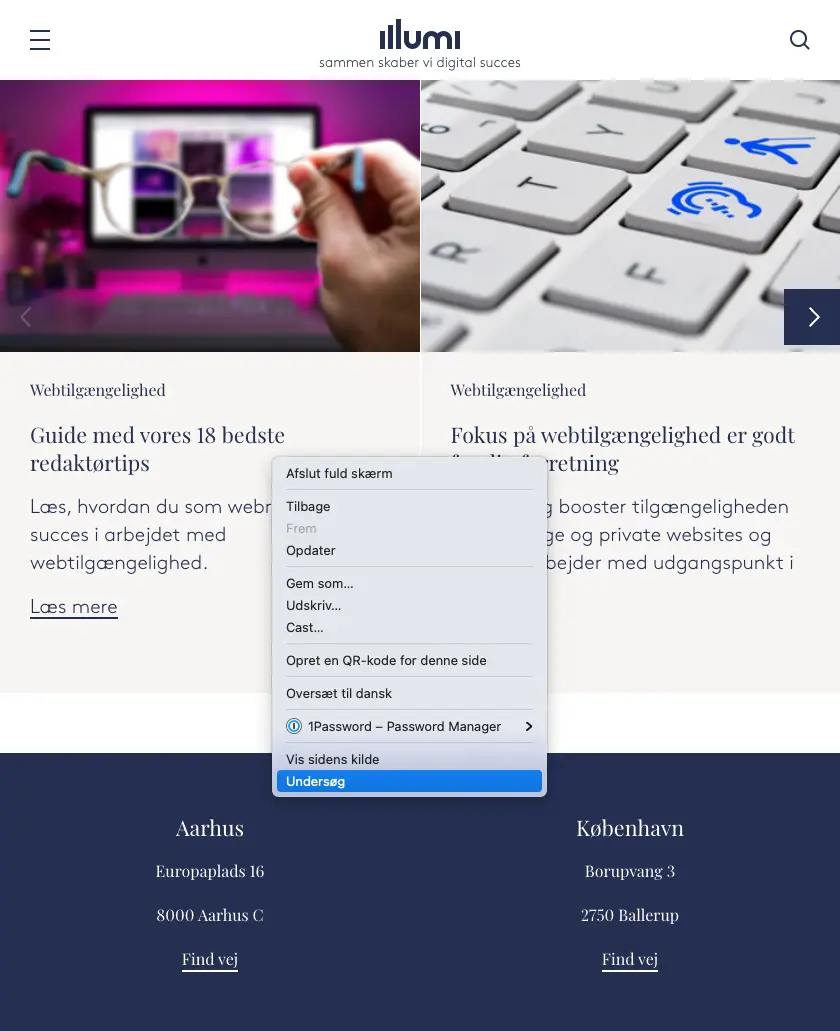
Right-click on the element you want to examine the colour of and select "examine" from the dropdown menu.
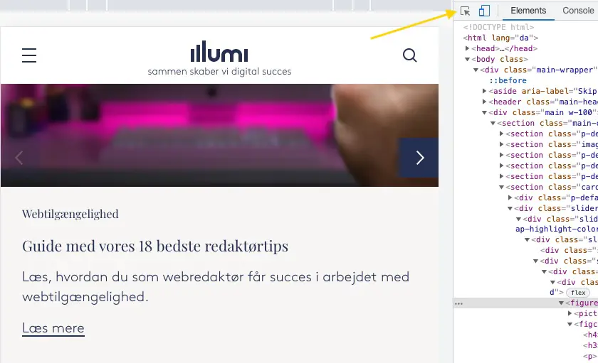
Click on the "Select" icon.
Hover over the element you want to examine and see the code on the highlighted colour.
You may be lucky that Google gives you a few accessibility hints about contrasting colours and using the tab function to navigate around the page.
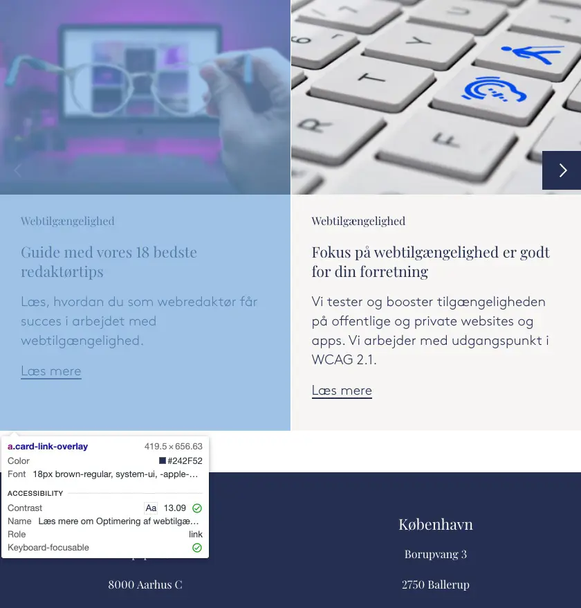
The code for the first colour we need in this example is #242F52. Follow the exact same procedure for the second colour of the test and enter them both in the tool you have found.
Images
We use images in different ways to support our message in the texts. The general rule of thumb is that an image should be flanked by an alt attribute that provides alternative information about the image, similar to the link titles we wrote about earlier.
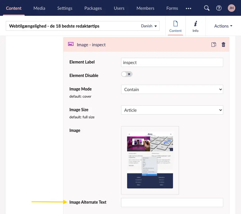
The vast majority of Content Management Systems have an input field in the editor interface for an image's alt text. Here is an example from Umbraco CMS.
A screen reader can't explain what's going on in an image, so as an editor you need to use the alt attribute to add value to the image in context.
You don't need to start your alt texts with "image of ...." as a screen reader automatically identifies the element based on the file type and announces to the user that the element is an image.
8. File name as default for alt text
Some systems are coded to use the image file name as the default alt text. This is generally not optimal as we rarely have a good discipline around file naming. A file name such as header-image.png says nothing about what the image shows and therefore does not create value for the visually impaired user. Another example is when the same image is used in two different contexts. Here, we may need to specify two different alt texts and therefore the file name is not sufficient.
Therefore, always provide an alt text unless it's a decorative image - you can read more about this in the next section of the article.
In the following, we'll go through different ways of using images and what you should be aware of in relation to your alt text.
9. Decorative images
Decorative images can be, for example, a background that simply supports the visual expression. These images are contextually irrelevant to a user who is partially sighted or blind. Despite this, these images should still have an alt attribute, but the value should simply be empty. This is because a screen reader encountering an image without an alt attribute will instead read the file name of the image to the user, which often adds little value. Therefore, you should leave the alt text "blank" on decorative images.
10. Informative images
Informative images can be images that support instructions and guidelines where the image shows someone performing the action explained in the text. For example, if the text is an instruction on how to use a fire extinguisher, a good alt text for the image would be "Woman shows how to remove the fuse by pressing the green button".
If possible, include specific colours in the image if they are important in the context.
11. Functional images
Functional images are e.g. a logo at the top that also links to the front page. It can also be an icon, such as the magnifying glass, signalling that a click activates a search function.
An alt text for a functional image should tell the user about the actions behind the icon/image. A good alt text such as "Search the page" is preferable to "search icon".
As an editor, you may not have access to define the value of the alt attribute on a functional image, so you may have to hand over the alt texts to a developer who will then add them to the code.
12. Images with text
Images containing text should generally be avoided for two reasons. Firstly, because screen readers cannot read and decode an image with text in the same way that normal vision can and secondly, when images are scaled to different mobile devices, the text becomes unreadable for most people.
Multimedia
If you use multimedia such as podcasts, video or live streaming, your hosting provider probably has a variety of tools that can be used to make your multimedia more accessible. On YouTube and Vimeo, for example, you can use transcriptions and captions to support the content of the video. If your multimedia files are embedded on the website, you may need a developer to make transcriptions and captions available in the media player.
Read below about the different options and what sets them apart.
13. Transcripts
Transcripts are text versions of what is said in a video, podcast or live stream. They are used by users with low or no hearing. There are many free and paid tools to generate a transcript of a video or audio file, and your hosting provider probably also has similar options that you can use after uploading a video or audio file.
Transcriptions can be automated or manual. Auto transcriptions are based on audio-to-text technology and, depending on the sound quality of your video, can automatically create a text version of what is being said in the video. However, it often requires a bit of post-processing to ensure that the right meaning and messages are conveyed.
With manual transcription, you convert the audio to text yourself, probably using a word processing programme.
Even without hearing problems, there will be times when you need to read a transcript - for example, when you're in a place where the internet connection is too poor to play a video, or you're sitting in a crowd without the ability to play a media file with audio.
14. Captions
Captions are subtitles that appear while a video is playing.
You can add open captions, which always play simultaneously with the video, or closed captions, which the user can switch on and off as needed. Closed captions are clearly preferable as they leave the control to the user, which is also an advantage in terms of SEO.
15. Audio descriptions
Audio descriptions are an audio track that narrates what is happening, allowing blind or partially sighted people to understand the action in the video. Captions tell what the characters are saying, while audio descriptions explain that an audience is clapping or that two people are embracing, for example. Videos without sound should always include audio descriptions if there is important visual information in the video.
16. Content that moves
Fast-moving content can trigger various types of seizures related to epilepsy and migraines. The rule of thumb is that there should be no elements that flash more than 3 times per second.
This free tool can test if a website is compliant. Photosensitive Epilepsy Analysis Tool
Accessibility check
WCAG is an abbreviation for "Web Content Accessibility Guidelines". WCAG is an international standard for web accessibility developed by W3C, which has also developed international standards for HTML and CSS.
The WCAG guidelines include a wide range of recommendations - divided into 3 levels - for making a website accessible to users with different disabilities. In Denmark, there are legal requirements for websites and applications of public organisations. The requirements include the first two levels A and AA of the WCAG 2.2 recommendations, which come into force in June 2025. In addition, there are some success criteria at level AAA that you should endeavour to meet.
There are many different digital tools for testing web accessibility, but not many that can test for all WCAG recommendations. Some tools test at the lowest level (A), some only test for developer-related requirements, and others test for specific requirements such as colour contrast ratio. We therefore recommend that you use several different testing tools as described in this article. This way, you can ensure that your good editorial work bears fruit in terms of web accessibility.
However, not all WCAG recommendations can be checked with a digital tool, so it may be necessary to supplement with a manual check using different tools.
17. Web Accessibility check with SiteImprove and LambdaTest
At Illumi, we use the tools SiteImprove and LambdaTest to get an overview of a website's performance - including accessibility. We always ensure that our websites comply with current WCAG standards, which means that from June 2025, WCAG 2.2 will apply.
18. Web Accessibility check with Google Developer Tool
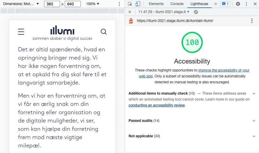
A free way to gain insight into a website's accessibility is by using Google's Developer Tool.
You can access the Google Accessibility Audit by clicking "Customise Google Chrome" - the 3 dots in the top right corner of your browser window.
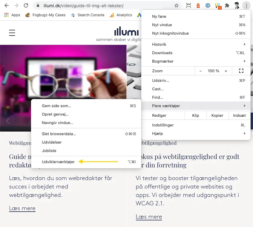
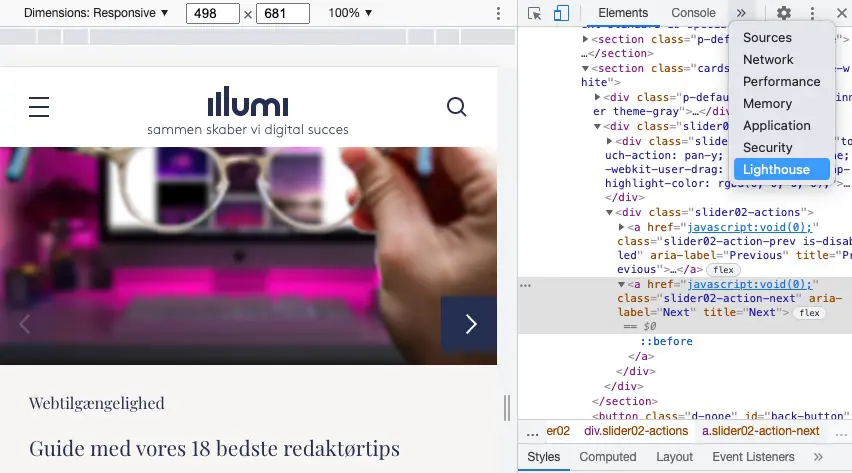
When the Developer Tool tabs open, don't be confused by the code you immediately see, but instead select the "Lighthouse" menu item.
The next step is to configure your audit. Here you select the Accessibility category and either mobile or desktop.
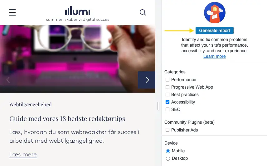
The result will show which accessibility errors the website has, and under each error you will also find a link to more information about the requirements and success criteria described in WCAG 2.2.

Do you need help increasing web accessibility?
If you need help identifying specific areas that are currently not compliant and/or implementing improvements, please contact
Client Advisor & Partner
Rasmus Bollerup
Want to know more?
Here you'll find inspiration and knowledge about everything related to your digital presence.

Web Accessibility
Meet web accessibility requirements
Is your website accessible to everyone – including people with disabilities? If not, let us help.

Introduction to web accessibility
Introduction to web accessibility
When your website is accessible, all visitors have a good experience, which benefits both them and your business.

img alt texts
Guide to img alt texts
Here are our top editor tips for working with img alt texts and web accessibility.

Image handling at Illumi
How we handle images at Illumi
Image management includes viewing, cropping, focus point, compression and optimisation of size and format.

Newsletter
Sign up for our newsletter
Get digital trends and opportunities delivered straight to your inbox.