

Normal
High usability and brand recognition
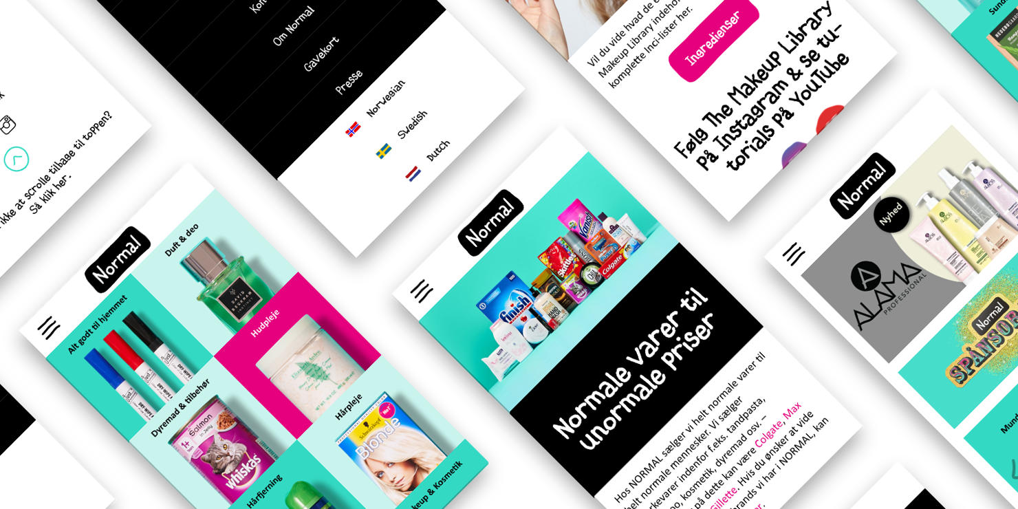
In just two months, Normal launched a new multilingual website, making it easier to showcase the full product range.

Website with a focus on brand recognisability
For several years, the advertising agency Envision has been Illumi's partner when a design assignment has evolved to include more in-depth digital elements that require specialised coding skills.
A week after the first meeting with Normal and Envision, we were up and running. Envision had already created a TV ad campaign and set the visual guidelines for the new website, and by the time Illumi was brought on board, the Normal campaign was just two months away from rolling out on TV screens across the country. In reality, we had one month to develop the platform for the new website, as Normal had to add content themselves afterwards.
It may sound like an impossible project to many, but here's how we pulled it off.

So what exactly did we do together with Normal?
We had three main tasks:
- Build a new website with product pages that focused on mobile usability and brand recognisability.
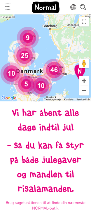
- Build a site with two language versions. We subsequently expanded to six languages.
- Train key employees in the use of the site.
The key to a fantastic multi-agency collaboration
In order to complete the task in such a short time, it was necessary to quickly and effectively align expectations between the three parties in terms of subject areas and decision-making competences. A realistic requirements specification and a mutual trust that we were each competent to make ad hoc decisions about the development of the site in our own areas were the reason why we succeeded on time with a well-functioning site. Well, and a lot of hard work - of course :-)
At Illumi, we had Jimmi Hassel on the job. Jimmi is a digital designer and an expert in translating advertising agencies' visual concepts into fantastic digital user experiences.
User-friendly website - without too many frills!
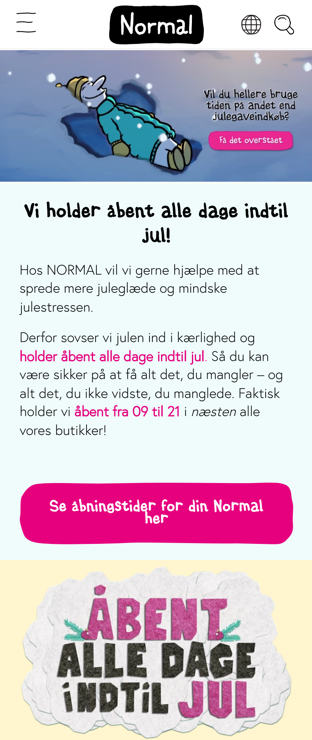
As a brand, Normal is known for its honest and 'normal' communication with consumers, and it was essential that the new website reflected the same honesty in design and functionality. The solution we developed together is first and foremost designed to give Normal's customers the best user experience from a mobile device - a user experience that is all about giving customers information about stores and product ranges. In its simplicity, the site should give customers answers to questions about where the nearest store is, what products they have on the shelves and what they cost.
Just for fun, you're completely normal
A website with multiple language versions enhances the user experience and ensures more direct communication with customers in markets other than Denmark. The solution we have developed together with Normal currently includes four language versions, with a fifth on the way. It's quick and easy to add more languages as the company decides to open stores in new markets. With meta tags, we have ensured that search engines know how to index the language versions correctly and display the correct language version when you visit the Normal website from a Norwegian, Swedish or German IP address, for example.
Why is too little time sometimes an advantage?
When working with Normal, time constraints were the deciding factor in ending up with a site that delivered exactly what it needed to in a simple and user-friendly way - and on time!
Was it easy? No, it certainly wasn't, because we had to constantly push "brilliant" ideas to the side and focus on MVP - Minimum Viable Product, which translates to something like "the least viable product".
In our experience - and this case is no exception - all parties involved in the collaboration need to make a number of choices that make the product much more simple and user-friendly for the end users. In this case, it had to be simple and manageable for Normal's employees to work with on their own, and it had to be a good digital experience for customers to visit the website.
When we at Illumi develop based on an MVP principle, we force ourselves to focus on the customer's requirements and the end user's overall experience and not our own nerdy solutions that we ourselves love so much. Our and our customers' 'darlings' are added on an ongoing basis if it makes sense at all and doesn't just add to the cost of the development task.
We prioritised a proper handover of the new site
At Illumi, we like to see our projects through to the end, and we only 'unleash' customers when we are sure they have the necessary insight to succeed with the new platform. Although time was short, we prioritised a workshop for Normal's key employees where we trained them to create new content on their own and to be responsible for the ongoing development and maintenance of the site's content. After the workshop, they were pretty much self-sufficient.
Illumi is great at execution. They are quick to move and understand the task, and they are quick to get things set up and delivered.
Søren Mølgaard Sivebæk, Head of IT at Normal
Want to know more?
Dive into some of our other services and solutions.

Web Development
Web development for those with complex needs
Many companies find that their website is holding them back.

Umbraco CMS
Umbraco CMS gives you a flexible and scalable website
Umbraco is a proven and widely used CMS that is completely free of ongoing licence costs.

Language versioning
Get a clear strategy for your language versioning
A multilingual website helps improve conversions and signals that you operate globally.

UX & Design
UX and design that drive user action
We create website designs with thoughtful information architecture, UX design and UI design. Guide your users to action through professional web design.

Odense Marcipan
Scalable Umbraco CMS platform for Odense Marcipan
We have created a scalable platform for Odense Group that brings together several websites in one common Umbraco solution.

DALI Speakers
Focus on language and rights management
DALI has a multilingual website that supports their global market strategy.

Business Academy Aarhus
New Umbraco web platform for Business Academy Aarhus
We upgraded to Umbraco 13, added new features and implemented a completely new design.

Operations, Security and Support
Operations, Security and Support
Operations is rarely seen as the sexiest service – but the ongoing life of your solution is just as important as its initial development.